You have less time than you think to make a first impression.
Research on web design puts the number at roughly 50 milliseconds, about the length of a single blink, before a visitor has already formed an opinion about whether your website looks trustworthy and professional.[^1] That opinion happens before they've read a single word of copy, and it's largely shaped by one thing: your hero section, the big banner area at the top of your homepage.
For outdoor, adventure, and tourism brands, this is a huge opportunity. Someone finds your rafting company, your e-bike rental, your guided trek, and in those first few seconds they're deciding whether to keep exploring or move on to the next tab. The good news is that once you know what makes a hero section work, it's a very fixable thing to get right.
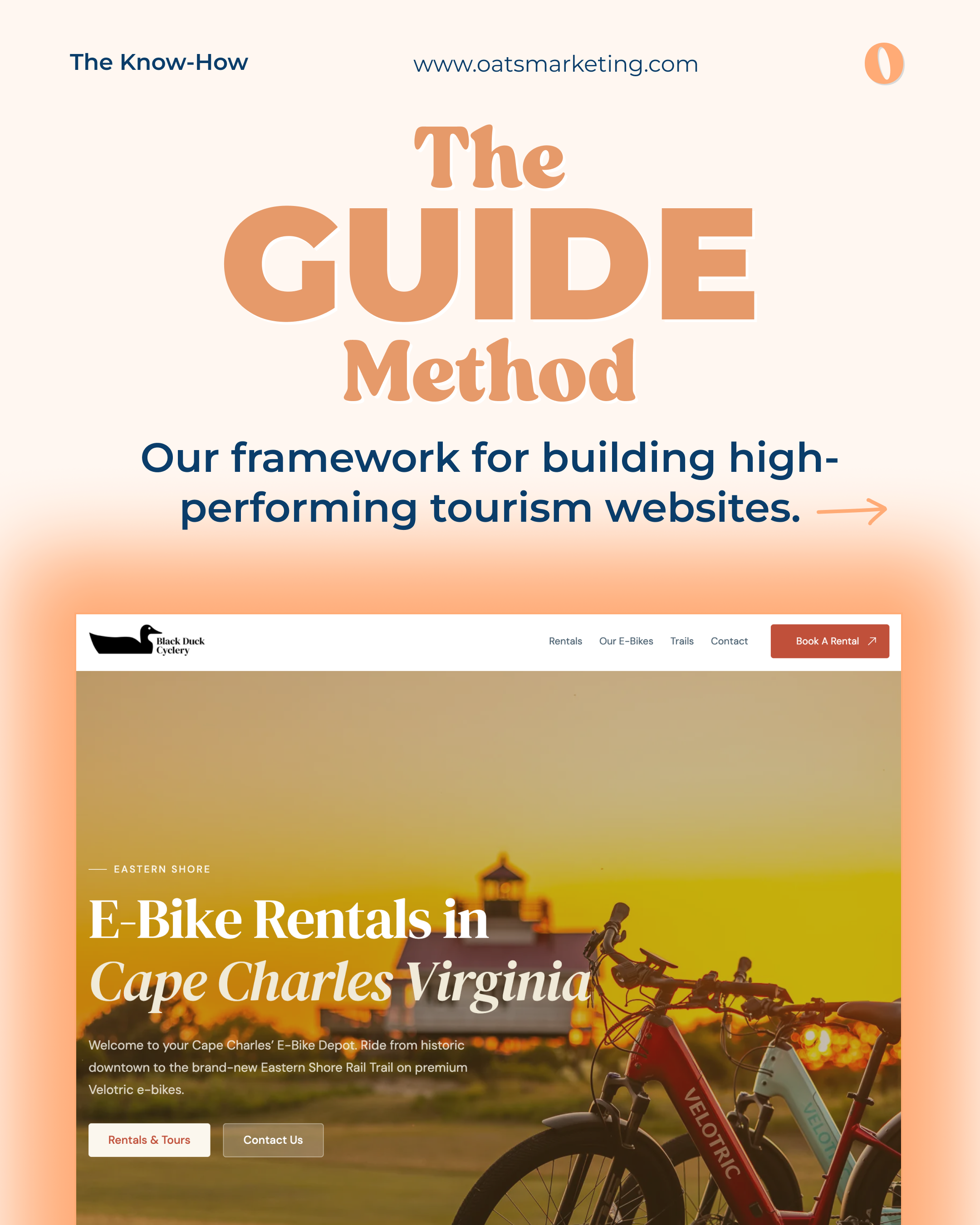
That's why we built The GUIDE Method, our framework for building hero sections that turn visitors into bookings.
What the Numbers Tell Us
Here's why the hero section deserves so much attention:
50 milliseconds. That's how long it takes a visitor to form a lasting first impression of your website, and that snap judgment is 94% design related.[1] Your offer could be amazing, but if the hero section looks dated or generic, it won't get the chance to shine.
2.6 seconds. That's the average time it takes a visitor's eyes to land on the one section of the page that shapes their overall impression, usually the hero image and headline.[^2] This is your best shot at telling them who you are and what you offer.
3 to 5 seconds. That's roughly how long a visitor gives your homepage to earn their trust once the snap judgment is made.[^3] In that window, your hero section needs to visually communicate credibility, clearly state what you do, and feel easy to act on.
A 1 second delay in load time can drop conversions by up to 20%,[^4] and the chance a mobile visitor bounces rises sharply once load time crosses the 3 second mark.[^5] Since 50% to 70% of adventure and tourism traffic comes in on a phone, a fast, clean mobile hero section matters just as much as the design itself.
The takeaway: guests feel your website before they read it. Once you understand that, you can start building a hero section that works with that instinct instead of against it.
Introducing The GUIDE Method
Our five-letter framework for building tourism hero sections, and the blueprint behind every website we build.
GUIDE is our framework for building the kind of hero section that earns a great first impression instead of losing one. It stands for:
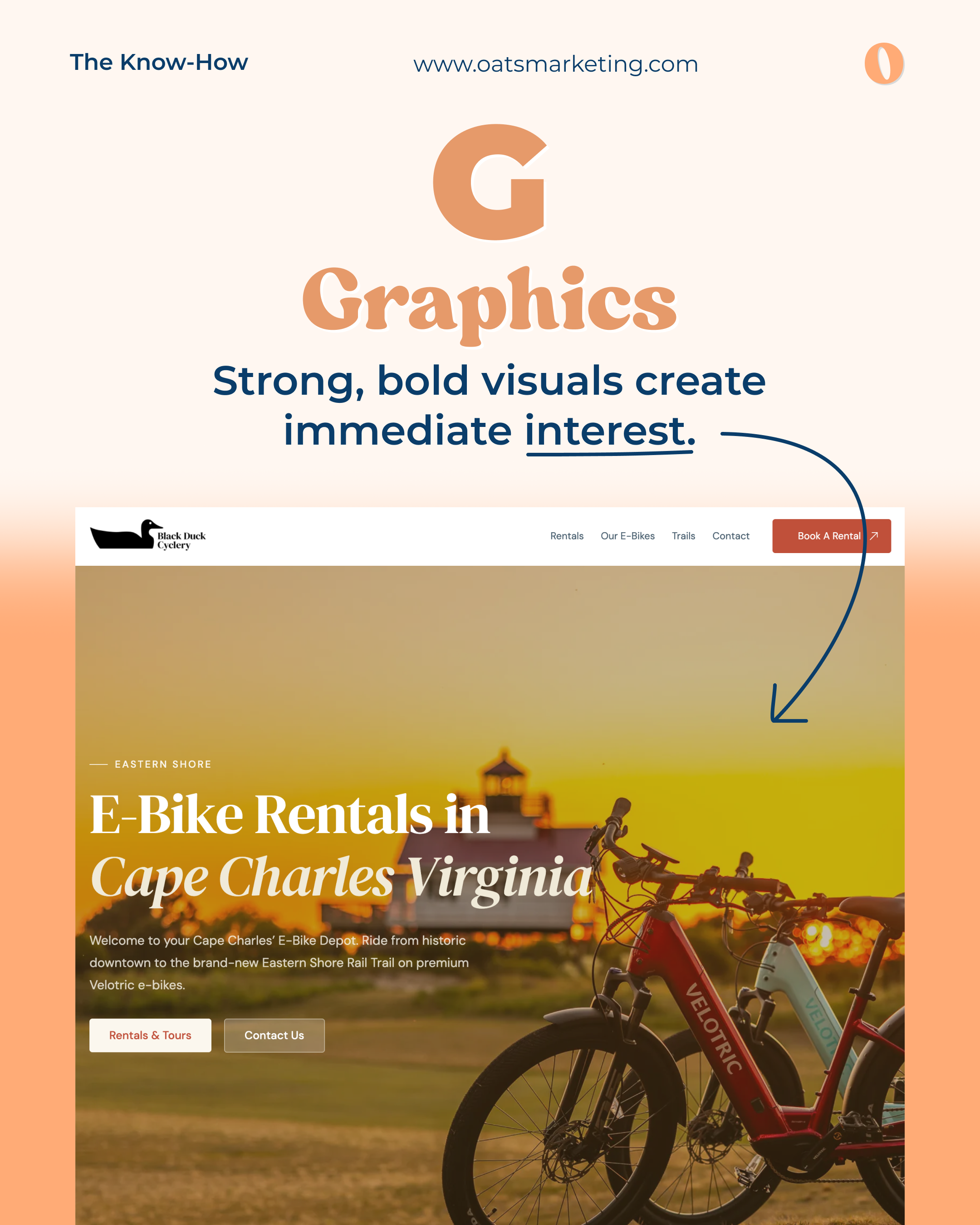
G - Graphics
Strong, bold, high quality visuals create immediate interest. This is the first thing a visitor's eyes register, before they process a single word.
A crisp, real photo of the actual e-bikes on location does more to build trust in one glance than any amount of copy could.
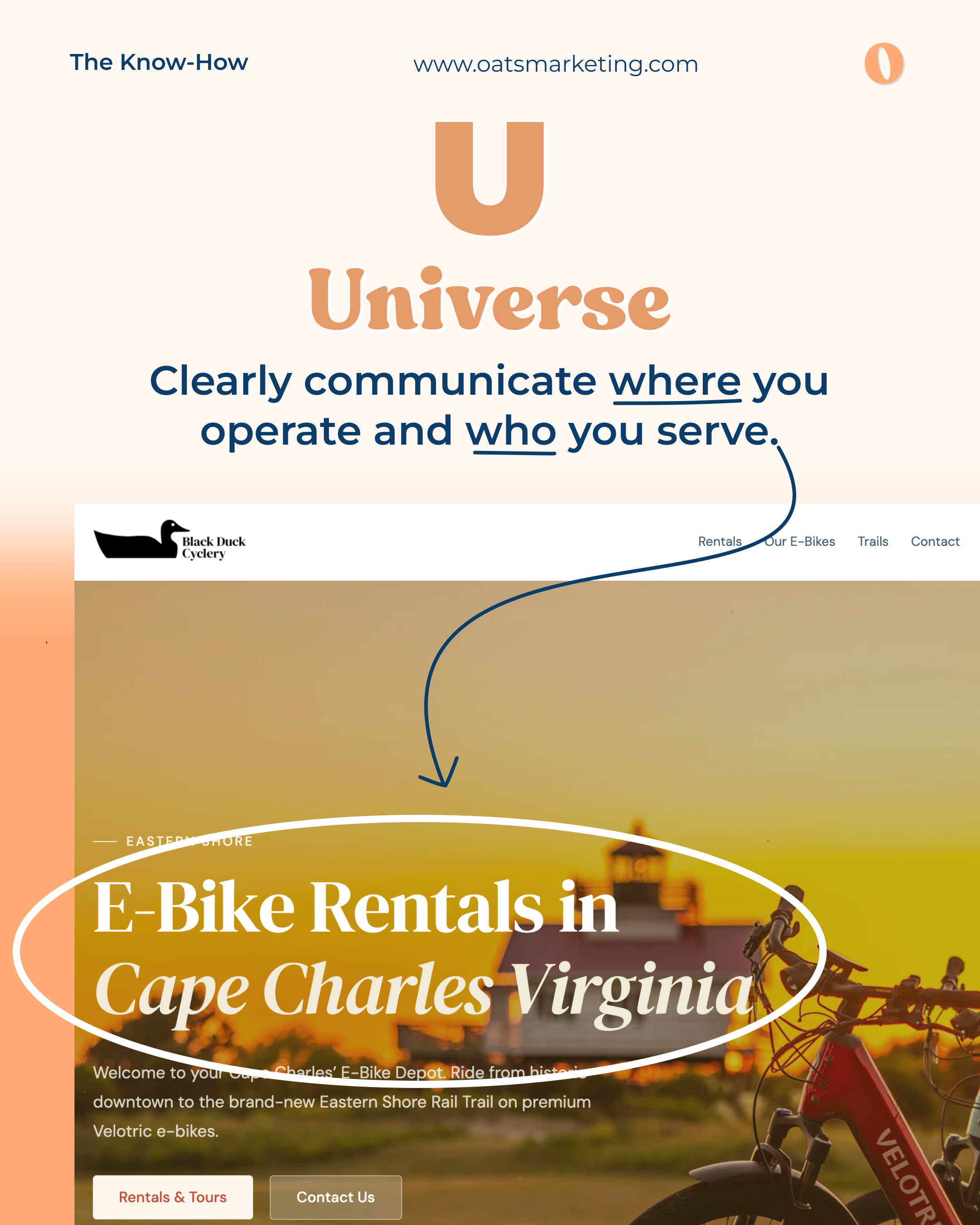
U - Universe
Clearly communicate where you operate and who you serve. A visitor should know your location and your niche within seconds of landing.
Naming the destination right in the headline, "Cape Charles, Virginia," tells a visitor instantly whether this is the trip they're looking for. If you're unsure of how to phrase this portion you can follow the this outline, "[Activity Name] in [place]", it's as simple as that.
E-Bike Rentals in Cape Charles Virginia
Fly on Hawaii's Longest Zipline
Food Tours in Nassau Bahamas
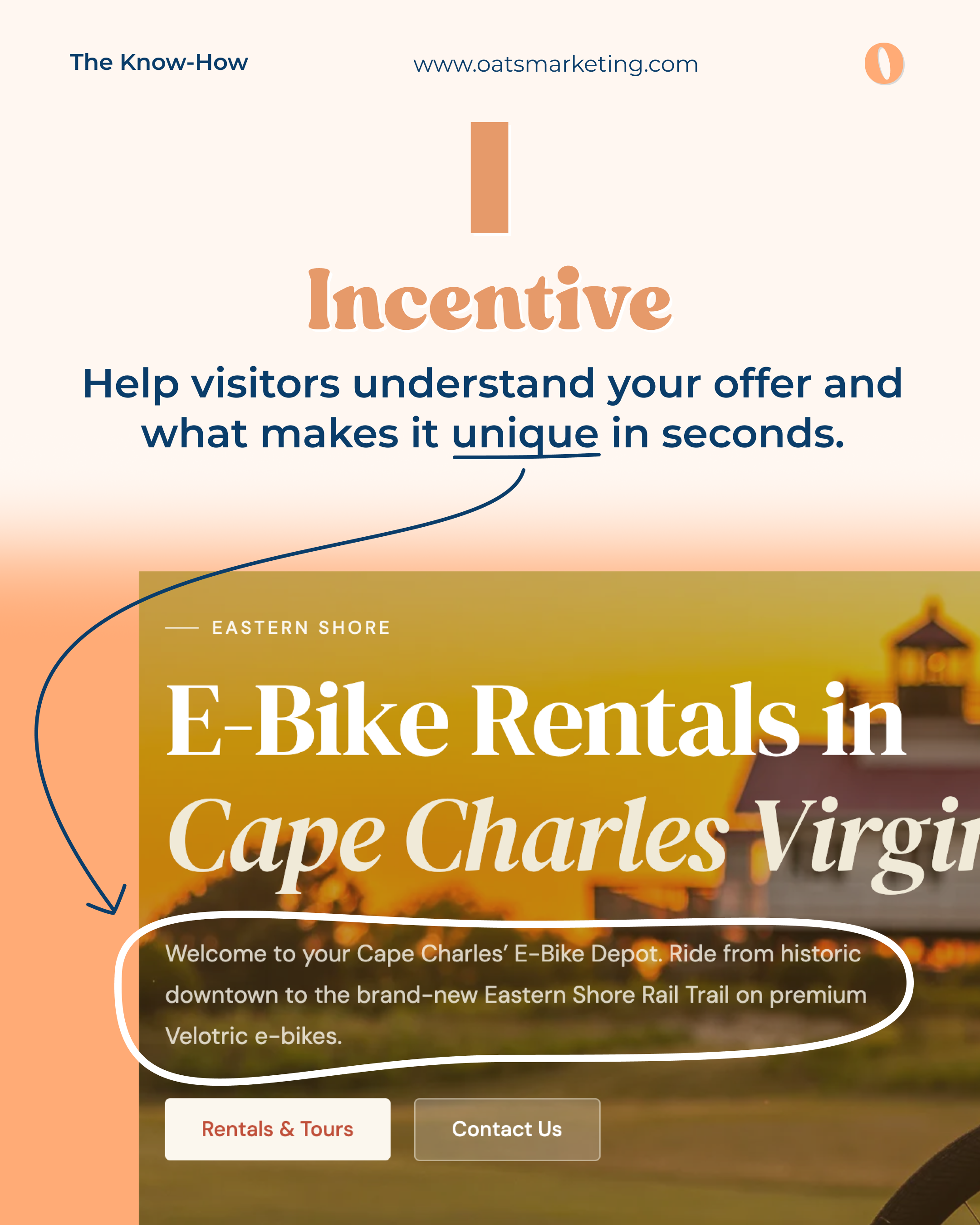
I - Incentive
Help visitors understand your offer and what makes it unique, fast. Why should they book with you instead of the next tab they have open?
One sentence explains the exact experience:
Ride from historic downtown to a brand new rail trail on premium Velotric e-bikes.
Zip. Paddle. Hike. Swim. All on Kauai's private Kīpū Ranch.
Eat, Drink & Discover Bahamian Culture on Food Tours in Nassau, Bahamas.
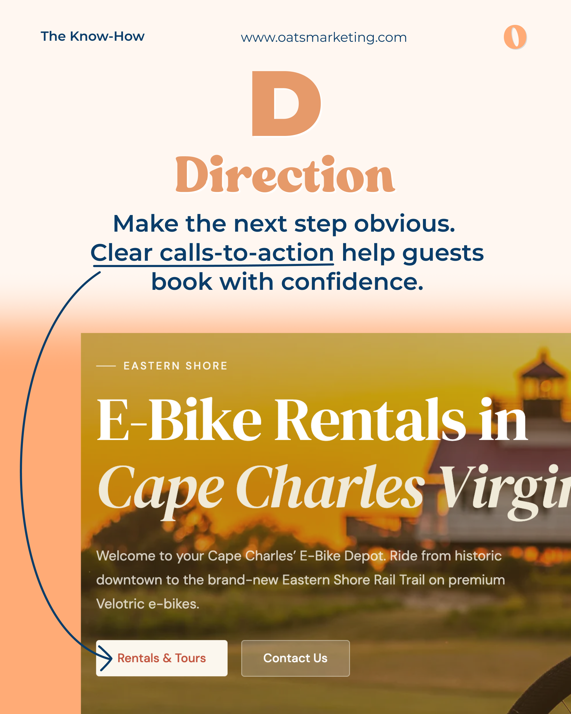
D - Direction
Make the next step obvious. Clear, repeated calls to action help guests book with confidence instead of hunting for what to do next.
"Rentals & Tours" tells a visitor exactly what happens when they click, which is what turns interest into an actual booking.
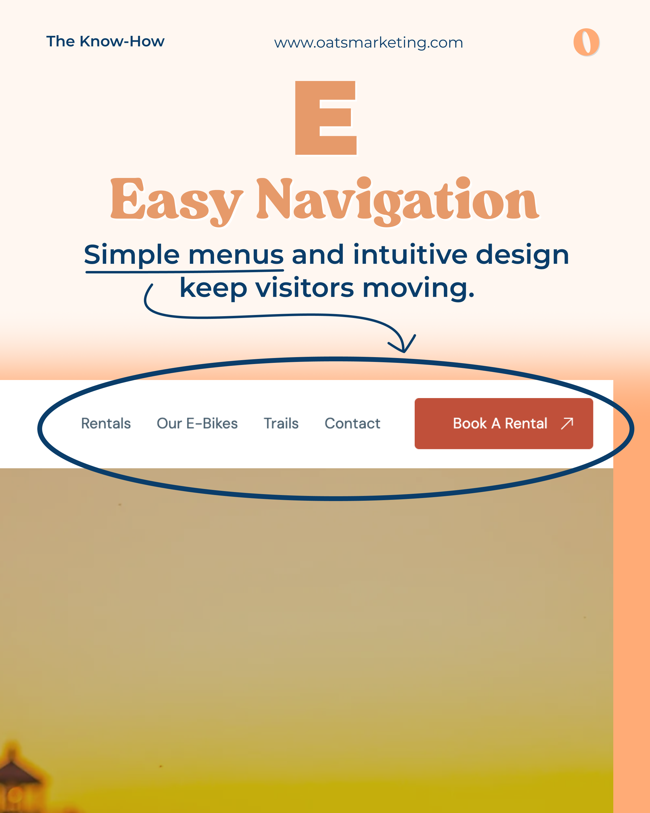
E - Easy Navigation
Simple menus and intuitive design keep visitors moving toward a booking instead of getting lost or overwhelmed.
A handful of clear menu items plus one highlighted booking button means a visitor never has to think twice about where to go next.
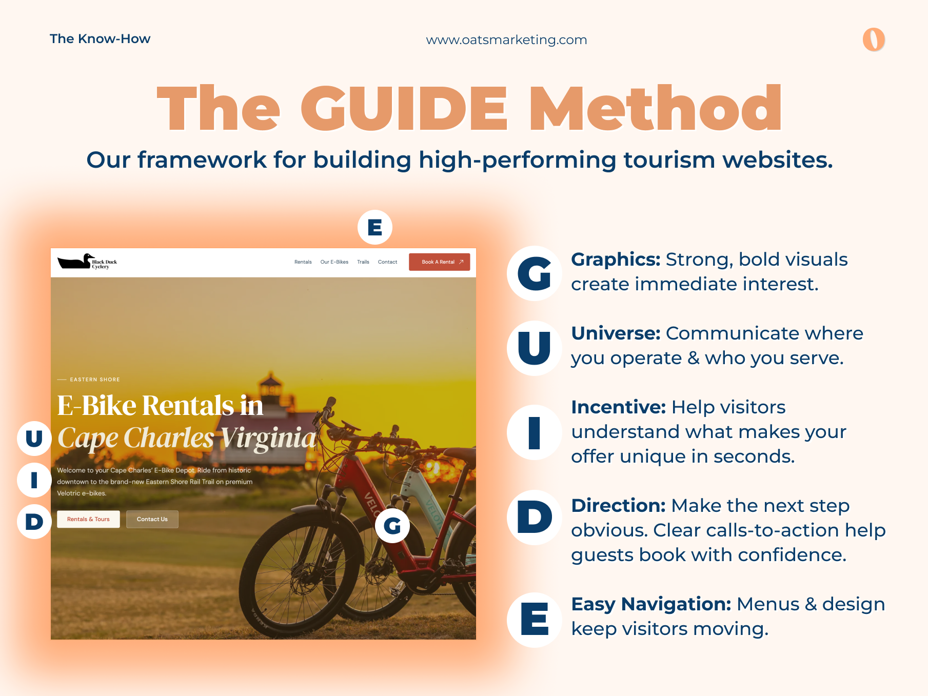
Here's what it looks like when all five elements come together in a real hero section, built for an e-bike rental company in Cape Charles, Virginia:
Every letter of GUIDE is doing its job in this one hero section: a bold photo, a named destination, a clear offer, an obvious CTA, and a simple nav bar working together.
Every one of those five elements is doing a job in the first few seconds a visitor spends on the page. Getting all five working together is what turns a good looking hero section into one that actually books trips.
Common Hero Section Mistakes We See, and the Good News About Them
The good news about the mistakes below is that they're all fixable. Once you know what to look for, most of these can be solved in a single round of updates. Here's what we see most often:
1. Blurry, grainy, or obviously AI generated images
Low quality photography holds a hero section back. If your hero photo is pixelated, poorly lit, or clearly stock, guests read it as "this operator had to use stock photography because their activity must not be good." A newer version of this problem is using AI generated images to represent a specific tour, or experience. Guests can often tell, and if they can't tell right away, they may feel misled the moment reality doesn't match the AI smoothed version they booked from. The fix is simple: use real photos of your real activities.
2. Unclear calls to action
"Learn More" and "Submit" don't tell a visitor what happens next or why they should click. Strong CTAs are specific and repeated at key decision points, in the header, in the hero section, and again as a visitor scrolls. "Book a Rental," "Reserve Your Spot," and "Find Your Trip" all work because they name the exact action and the exact outcome. This is often a quick, high impact fix.
3. Not telling visitors where you operate
A visitor searching for a horseback riding or a kayak tour usually already knows the destination they want. If your headline doesn't say "British Columbia" or "Cape Charles, Virginia" or "Sedona," they can't confirm in that first glance that you're even relevant to their trip. Saying the place by name, right in the hero section, is an easy win once you know to look for it.
4. Not clearly communicating what you actually do
Vague, brand voice first copy like "Adventure awaits" or "Explore the extraordinary" sounds nice but doesn't tell a visitor much. A guest deciding between a few tabs doesn't have time to interpret brand poetry. The goal is to be so clear about what you offer that it would be hard for someone not to understand it in one read. "E-Bike Rentals in Cape Charles, Virginia" beats "Ride Into Adventure" because it actually tells the visitor what's for sale, and that clarity is something any hero section can build in.
The Bottom Line
Guests planning outdoor experiences and travel are moving fast, comparing options, and making quick judgments about who to trust with their vacation. Your hero section gets that first 50 millisecond glance, and a few seconds after that to earn a closer look.
The GUIDE Method exists to make sure your hero section is working in your favor: sharp visuals, a clear sense of place, an obvious reason to book, a clear next step, and a site that never makes a visitor think too hard about where to click.
Now that you know what to look for, you're already halfway to fixing it. If you have questions about how your hero section stacks up, schedule a call with us here: oatsmarketing.com/book-a-strategy-session.
Frequently Asked Questions
What is a hero section?
The hero section is the large banner area at the very top of your homepage, the first thing a visitor sees before they scroll. It typically includes a main image or video, a headline, a short sentence explaining what you offer, and one or two buttons. It's the most valuable real estate on your entire website, because it's the part almost every visitor will see, and often the only part they'll see before deciding whether to keep going.
What are the most common mistakes with website hero sections?
The four we see most often with outdoor and tourism brands are:
Low quality or AI generated images. Blurry, grainy, or clearly artificial photos undercut trust immediately, especially when they're standing in for a specific tour or trail that guests will expect to match reality.
Unclear calls to action. Buttons like "Learn More" or "Submit" don't tell a visitor what happens next. Specific CTAs like "Book a Rental" or "Find Your Trip" convert better because they name the action and the outcome.
Not saying where you operate. If the destination isn't in the headline, a visitor can't confirm you're relevant to the trip they're planning.
Not clearly saying what you do. Vague brand language sounds nice but doesn't answer the one question a visitor actually has.
Other frequent issues include hero sections that load slowly, hero text that's unreadable on a phone, and navigation menus placed over a busy photo background instead of a solid color.
How long should hero section copy be?
Short. A headline that names what you do and where you do it, plus one or two sentences explaining the specific experience, is usually enough. Remember that visitors are scanning, not reading, in those first few seconds. If a sentence isn't helping someone decide whether to book, it probably belongs further down the page.
Does the GUIDE Method only apply to the homepage?
The homepage hero section is where it matters most, but the same five principles apply to any page a guest might land on first, including tour pages, landing pages, and destination pages. If someone can arrive on that page directly from Google or an ad, it needs to answer the same questions.
Who does OATS Marketing work with?
We work exclusively with outdoor, adventure, and tourism companies that provide experiences and activities. Think guided tours, rafting outfitters, e-bike and equipment rentals, climbing and ski guides, charter operators, and similar businesses that get people outside and experiencing the world.
We don't work with product based companies. If you sell coolers, skis, or gear, we're not the right fit, and we'll happily point you toward someone who is. Focusing entirely on experience based businesses is what lets us understand booking systems, seasonality, shoulder season demand, and the way travelers actually research and book trips.
What does OATS stand for?
OATS stands for Outdoor and Travel Specialists. The name reflects exactly what we do and who we do it for, which is the same clarity principle we apply to every hero section we build. If a visitor has to guess what your business does, something has already gone wrong, and we hold ourselves to that same standard.
How do I know if my hero section needs work?
A few quick self checks: Pull up your homepage on your phone. Without scrolling, can a stranger tell what you offer, where you're located, and what to click next? Are the photos sharp and real? Does the page load quickly? If any of those answers are shaky, there's likely room to improve, and it's usually a smaller project than people expect.
Can I fix my hero section without rebuilding my whole website?
Often, yes. Swapping in better photography, rewriting a headline to name your destination, and changing a button label are all changes that can be made without touching the rest of the site. Bigger issues like slow load times or a cluttered navigation menu may take more work, but plenty of hero section improvements are quick wins.
[^1]: CXL, "First Impressions Matter: Make a Great One With Visual Design," based on research by Lindgaard et al., Carleton University.
[^2]: Missouri University of Science and Technology eye tracking study, via ScienceDaily.[^3]: SAMPS, "The Science of First Impressions: Why Your Website Matters More Than You Think."

.jpg)